



If you run a professional service business, you have probably felt the pressure to do everything online. Blog weekly. Post daily. Build a funnel. Learn video. It is a lot, and most of it was invented for businesses that look nothing like yours.
Here is something I have learned over ten years of building websites for lawyers, therapists, financial advisors, coaches, and consultants: for most professional service businesses, a simple brochure website is the right strategy. Full stop.
Let me show you why, and what yours should actually do.
First, what is a brochure website?
A brochure website is a small site, usually four to six pages, that tells people what you do, who you serve, and how to work with you. There is no store, no member portal, no content machine humming behind it. It presents your practice clearly and gets out of the way.
The word "brochure" makes some business owners flinch, like it means they settled for less. I see it differently. A brochure website is a deliberate choice that matches how your clients actually find you.
Your clients are confirming, not comparing
Most professional service businesses grow through referrals. Someone's accountant mentions your name. A colleague passes along your info. A past client tells their sister to call you.
That person then does one thing before reaching out: they look you up.
This is the moment your website exists for. Your visitor arrived with a recommendation from someone they trust. They are looking to confirm what they already heard. Your website's job is to say yes, this person is who they said, this practice is established, this is where you get started.
That is a very different job than convincing a cold stranger to pick you out of a lineup. It takes a very different website.
A real example
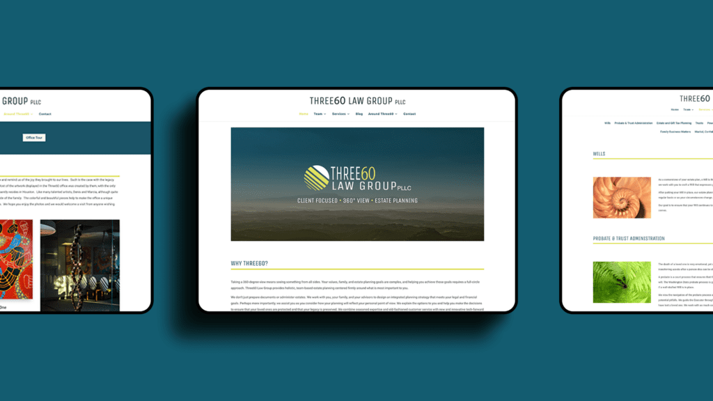
One of my clients is an estate planning firm serving high-net-worth families. Nearly all of their business comes through industry referrals: financial advisors, accountants, other attorneys. Their marketing is refreshingly simple. Social media accounts that exist but stay quiet. One holiday email a year. A clean brochure website.
They have a waitlist for estate planning services.
The website works because it does its actual job. It confirms what the referral source said, explains the practice clearly, and makes booking an appointment easy. And as their reputation has grown, something interesting happened: more clients started finding them through search engines too. The same simple site serves both.
The five jobs of a great brochure website
Every effective brochure site I have built does these five things, whatever the profession:
1. It says exactly what you offer. Plain language, no guessing. A visitor should understand your services within seconds of landing.
2. It shows who succeeds with your service. Who is this for? When a visitor recognizes themselves in your description, they relax. They are in the right place.
3. It explains the process and the outcomes. What happens when someone hires you? What can they reasonably expect at the end? People buy professional services with more confidence when they can picture the experience.
4. It makes getting started obvious. One clear next step. Book a call, fill out a form, send an email. Whatever it is, it should be impossible to miss.
5. It backs you up with social proof. Accreditations, testimonials, case studies, awards. Your visitor arrived trusting a recommendation, and social proof lets them see that trust reflected by others too. This one deserves its own deep dive, and I will write about it soon.
That is the whole assignment. Everything else on your site should support those five jobs or come off the page.
Where brochure websites go wrong
The failures I see are rarely about missing features. They are about mismatch.
Your website carries a vibe, and that vibe should match the service you provide. When someone lands on a confusing info dump, built without any thought for what a potential client is trying to figure out, they draw conclusions. A dated site, a broken contact form, a wall of jargon: visitors quietly assume the service will feel the same way. Fair or unfair, your website stands in for the experience of working with you.
The fix is rarely more content. It is clearer content, organized around what your visitor came to learn.
What this looks like in my own business

I have run a mostly referral-based business my entire career, and for most of it I did very little marketing. My website confirmed what referrals heard, and referrals kept coming.
Referrals also arrive on their own schedule. If you have lived through the feast and famine cycle, you know the whiplash: three inquiries in one week, then silence for a month. That is the honest reason I am rewriting my own site and adding more marketing right now. I want steadier ground under my business, and I am figuring out what that mix looks like as I go.
What I refuse to do is burn myself out getting there. I am only adding marketing that is low stress and fits my actual workload. And here is something I have noticed from the buyer's side: even a few posts are enough to signal you are established and legit. You do not have to feed an algorithm daily to look credible.
If your site is dated or broken right now
Start smaller than you think. A simple one-page site covering the four jobs above will serve your practice better than a sprawling site that confuses people or a "coming soon" page that turns them away.
Get the bare-bones version live first so potential clients can keep reaching out. Then build the bigger resource site behind the scenes, on your own timeline, without ever disrupting the path from referral to phone call.
The permission slip
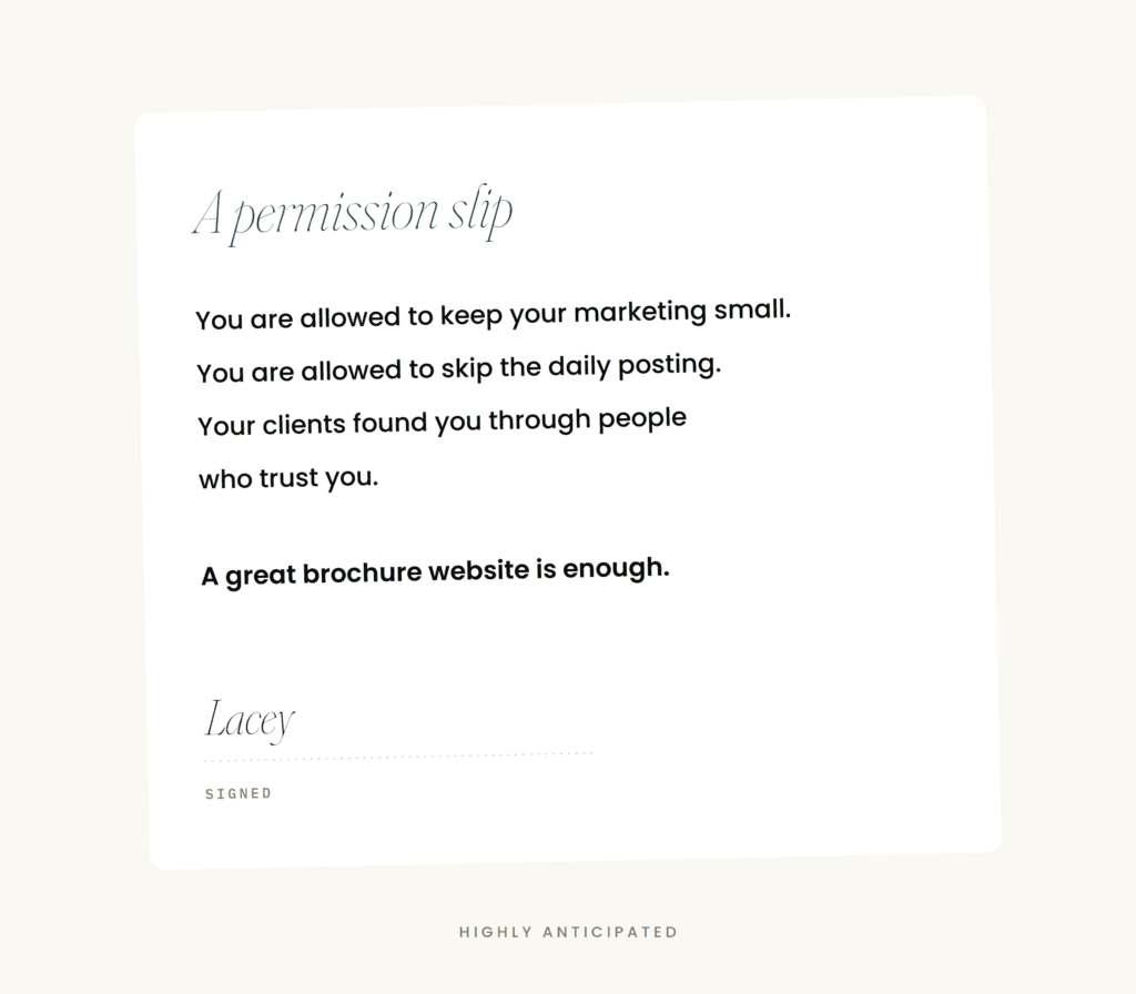
If you have been carrying guilt about your quiet Instagram or your nonexistent blog, set it down. Your clients found you through people who trust you. Your website's job is to honor that trust and make the next step easy.
A great brochure website is enough. Build that first, build it well, and let your work do the rest.